With the propagation of data science throughout most industries, the quality of inventive graphics on websites has gone through the roof. This page came across my Facebook feed and is a great example of how awesome interactive graphics can be on a site.
Let’s play “Good figures, or bad figures?”!
Setting the table
First, let me saw that the page is beautifully designed. If you’re looking at this on a mobile device, stop right now and go to a computer. Someone managed to get their graphics in line on the web page and make them sticky at the top of each section and make each one of the graphics fully interactive. This is just plain badassitude made html. I certainly have no idea how this is done. I’m guessing it’s some flavor of Bokeh, but it’s just plain cool.
Just a note here that all of the image below are just screen captures from me playing with the website.
Figure 1: Breakdown by Gender.

Pros:
- Interactive
- Easily understandable
- Gives an unbiased view into the data.
Cons:
- Color scheme maybe could be better.
- “Integrated” or “Combined” data could have been color coded to indicate which of the genres are responsible for which bubbles.
- In general, I don’t like red-blue color schemes in anything except obviously political plots. There are more pleasing contrasting color schemes that I like better (orange/green, for example).
Overall verdict: Good figure!
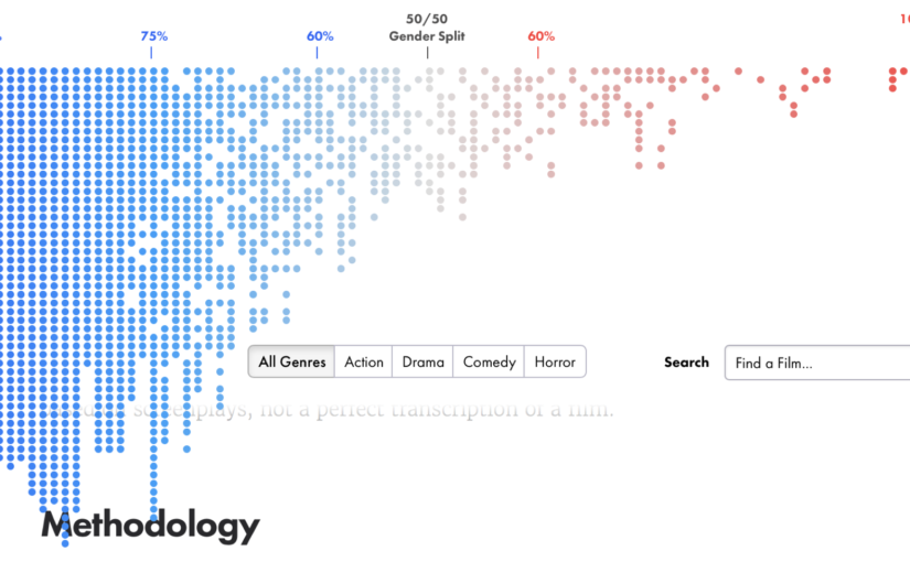
Figure 2: Interactive figure showing the breakdown of Male/Female lines per genre.

Pros:
- Interactive is awesome. When you hover over each slice fo the color bar, you get the film that’s associated with that location.
- If you click on each location in the color bar, you get the underlying data for the film, including the number of lines for each character (color coded by gender) and a time-series plot that shows the dialog-per-gender as a function of time. It gives you some kind of idea whether the film. For example, in *Aliens* you can see that both genders are represented throughout the film (though *SPOILERS*, this doesn’t imply that all characters survive to the end…).
Cons:
- The length of the main bar scales with the number of films in each genre. This has subtle implications for what’s you take away from the figure.
- First: It means that only the “All Genre” button will make use of the entire horizontal space. Since all subsequent subsets are smaller, the bar shrinks.
- Second: The indicated 50/50 split is the location on the bar where dialog is split 50/50 between men and women. This means that when you consider a particular genre, the location of the 50/50 line always because the number of films in the genre shrinks. The result is that it’s impossible to compare the figure across genres (which must be what the authors are intending here).
- Verdict: Almost a good figure. I think it would have been more powerful (and easier to compare against the genre-specific data) by fixing the size of the bar to the “all genre” data and simply only showing the slices that correspond to a particular genre. This “patchy” color bar isn’t as pretty, but it would show the contribution of all of the sub-genre’s and it would also allow for a direct comparison of the data across genres.
Figure 3: Percentage of Dialog by Actor’s Age

Pros:
- Everyone understands histograms, even ones that go sideways.
- Inset shows the data cross all ages and clearly shows the difference in the mean age for Actors and Actresses.
Cons:
- The inset figure could have been given as a third panel.
- The scaling of the Y-axis could be indicated. It’s probanbly “percentage of lines” since the Actress and Actor curves peak at roughly the same location.
Verdict:
- Good figure!
Figure 4: All Film Dialog by Cast Member and Gender
It’s hard to call this a figure at all. This is one of the prettiest ways I’ve ever seen to show all of the underlying data in an easily navigable way. I’m not even going to do a deep dive into this one, and just call it great!
Have a web page that you stumble across that you’re wondering “Hey, I wonder if those figures are good or not?”? Drop me a line

Leave a Reply